


Boutique premium music
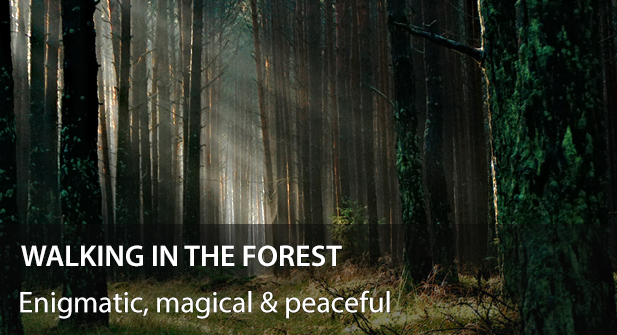
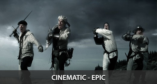
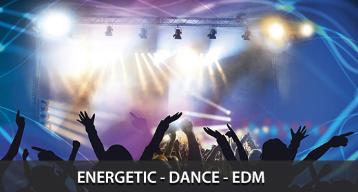
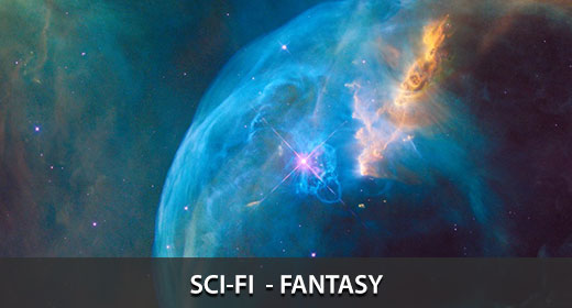
Main collections by genre, mood or music style
| | ||
| | | |
| | | |
Featured by AudioJungle as “Song of the week”
About Me
I’m musician, composer and web designer from Argentina, I’ve started learning classical piano since the age of five, and I kept studying music for several years, then as I grew up, I’ve started interesting in other kinds of music and styles, like rock, pop and electronic music.
Through the years I’ve made songs for short films, broadcasting ads, video presentations, tv shows, rock bands and other kinds of projects around the globe.
If you want to get updates subscribe to my newsletter
Thanks !
IMPORTANT: YouTube usages note
I registered all my music with AdRev to track any unauthorized use of my music on YouTube.
The License Certificate purchased via AudioJungle is used to demonstrate to YouTube that you are a legitimate user and have full rights to use the music within your online videos and productions.
So to clear any potential ‘Third Party Content’ claims, please visit this page using your video links and copy/paste in the contents of your License Certificate and state that you ‘have licensed music by Rodrigo Noales / Sonicbyte’. Claims are cleared within 24 to 96 hours.
If you are only using my music on your channel, please contact me directly with your channel link and purchased License Certificate (copy/paste the contents) and I can have your YouTube channel whitelisted, meaning you will not receive copyright notices on your monetized videos that contain my music. Thanks.
About Me
I’m musician, composer and web designer from Argentina, I’ve started learning classical piano since the age of five, and I kept studying music for several years, then as I grew up, I’ve started interesting in other kinds of music and styles, like rock, pop and electronic music.Through the years I’ve made songs for short films, broadcasting ads, video presentations, tv shows, rock bands and other kinds of projects around the globe.
If you want to get updates subscribe to my newsletter
Thanks !
IMPORTANT: YouTube usages note
I registered all my music with AdRev to track any unauthorized use of my music on YouTube.
The License Certificate purchased via AudioJungle is used to demonstrate to YouTube that you are a legitimate user and have full rights to use the music within your online videos and productions.
So to clear any potential ‘Third Party Content’ claims, please visit this page using your video links and copy/paste in the contents of your License Certificate and state that you ‘have licensed music by Rodrigo Noales / Sonicbyte’. Claims are cleared within 24 to 96 hours.
If you are only using my music on your channel, please contact me directly with your channel link and purchased License Certificate (copy/paste the contents) and I can have your YouTube channel whitelisted, meaning you will not receive copyright notices on your monetized videos that contain my music. Thanks.
Some artists who use some of my songs on their work
New Zealand – North Island Short Film
Animated Nature Scene
Blackwords Swordfish
Public Collections
View All Collections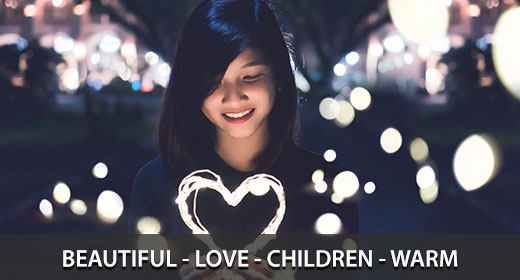
Featured Item

Tense Uplifting Energetic Melody Edm
6 purchases
I am available for Freelance hire
Email Sonicbyte
Please sign in to contact this author.
Social profiles